Pages

Saturday, August 9, 2014

I May Have Ruined It

"I may have ruined it."  This thought goes through my mind every time I'm working on a drawing or painting.  It's inevitable.  I just push the negative thought out of my mind and I see if I can fix it. Or live with it.  As an artist I've always been interested in experimenting with style and technique.  I do tend to stick to the very basics that I've learned over the years but I'm always looking to try and bend or break those rules to create an interesting piece.  This new piece was a bit of a challenge.  I was extremely happy with how the initial watercolor painting turned out in terms of capturing the subject as well as my brush strokes and use of color.  To me, it is proof that the new techniques and study of color theory are helping me advance as an artist.  So my first notion was to call it finished.  However, the painting felt unfinished the more I looked at it. It was nagging at me. So,  I wanted to see if I could push the painting further and create something NEW with it.  I've probably done thousands of figure drawings and paintings over the years.  I have maybe 30 or 40 plaid drawings and paintings from the last 12 years or so.   I wanted to see if mixing in some of my color field/ plaid ideas could create a new and interesting composition.  So I just said to myself, "so what if I wreck it?" I tried something new and hopefully will learn from it.  Without hesitation I drew some light lines over the painting to create a general grid and started playing with acrylic paint, brushes, a pallet knife and some tape.  So I might have ruined it. To some out there I probably did and that's just fine with me.   I'm still happy enough with the work to share it and the experience with the world.

Here it is, with the few photos I took from start to finish-

Watercolor painting from a black and white photo I found online


And finished...


Friday, July 25, 2014

Art Dump!

Here is all my recent work that I deem good enough to share with the world- Enjoy!  Any purchase inquiries please message my facebook page.

Matt


Wednesday, June 25, 2014

Portrait Watercolor Process

Hello Everyone, seems about the right time for a semi annual blog about my painting process.  This time around I will discuss my most recent portrait painting and some background on my influences and where I've developed some of my techniques. 

So first I'll go over my influences. I have a great many artistic influences but when it comes to watercolor there only a select few I've followed over the years.  Charles Reid is one, especially for his use of color and his brush controlI've tried to emulate his loose and expressive style but honestly, that is still a work in progress.  Another great influence in terms of color theory is the great Jim Ames.  I've posted info about his book on color theory in the past and I still highly recommend everyone checks it out for tips on how to build beautiful values.  David Mack is another artist whose work I've appreciated over the years, especially his mix of realism and abstract.  There are a great many other artists that I've picked up books and tips from over years and I've borrowed from all of them in one way or another to create my own style.... which i prefer to think as a loose technique with hints of photo realism. 

The painting in this post was a recent commission for a baby portrait.  When I'm working on portraits I prefer to use photo reference to help capture the essence of my model.  Here is the original photo-
  She's a darling, right?  After playing around with some sketches I cropped out the areas I felt unnecessary and focused on her wonderful eyes and smile. basically this area-
I want the focal point of the painting to be her eyes, nose and mouth so that will have the most detail.  I loved the contrast of red/pink and green so I wanted to build a loose wash surrounding her in the back ground and really focus on building on the shapes and forms for her face.  So I started by using a 2h pencil and mapped out the drawing on 140lb cold press paper.  I prefer Arches for my watercolor paper but Fabriano is very good as well.  For best results don't go below 140 lb.  The paper fiber will either fail or warp terribly. 


The drawing process is always the longest portion of portrait painting for me because I want to get it right, there's no point in doing a portrait if I can't capture the subject... Plus. I'm just an insanely slow drawer... draftsman?  Whatever the correct term, I'm slow.  I use several methods usually free hand for expressive purposes but for this one i used a loose grid system to capture as an exact of a likeness as I could.  

I then built my palette.  I only used 3 brushes on this one, all Winsor & Newton brand, a #10 round for the majority of the painting,  a flat, mostly for clean edges, and a #4 round for fine detail.  Here are the colors I used as well (all Winsor & Newton paints and a John Pike palette, they are the best)-
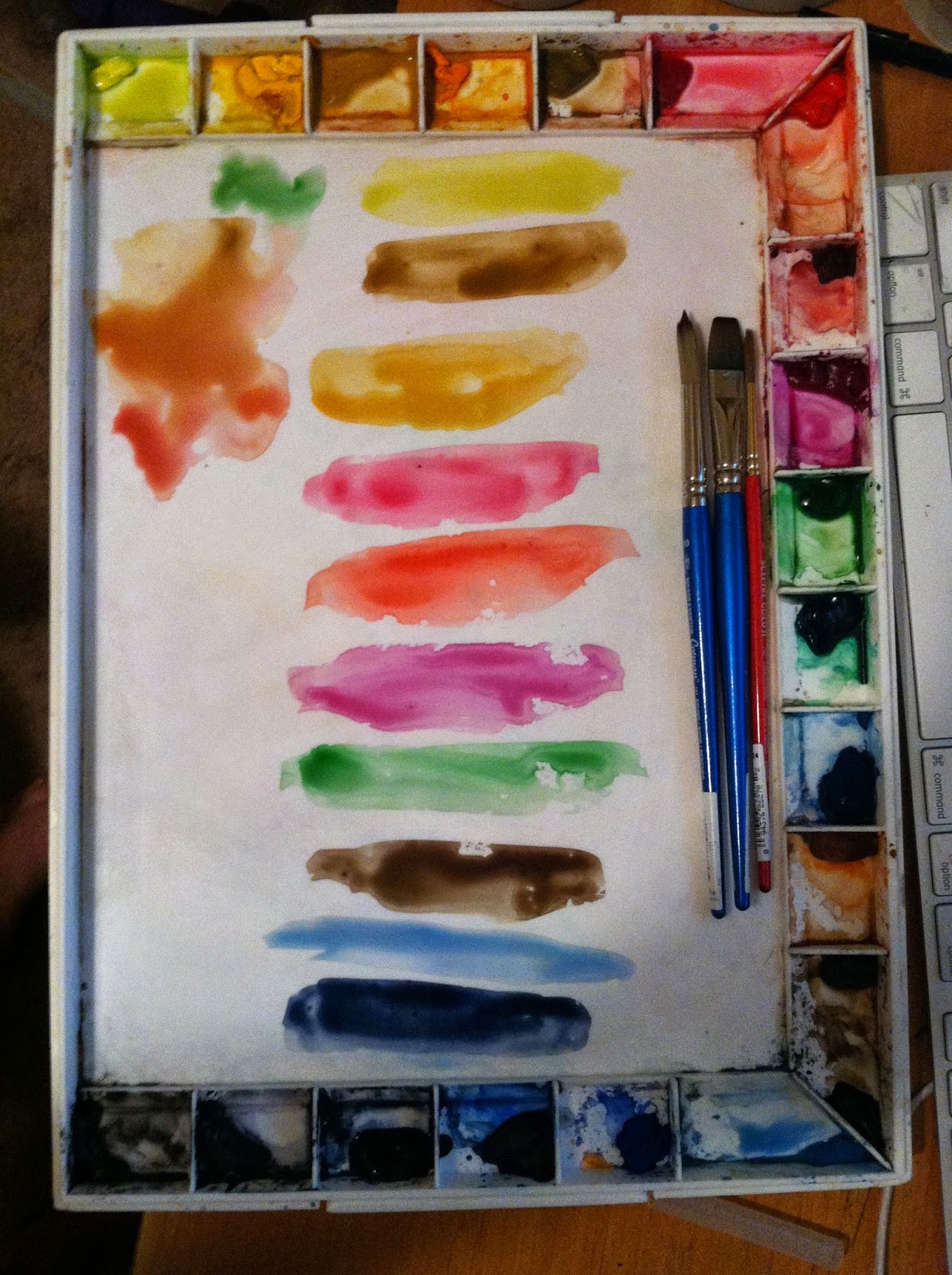
cad yellow light, yellow ochre, raw umber, permanent rose, cad red, hookers green, permanent magenta, sepia, cerulean blue, indigo
I start by blocking in basic shadows and shape of the face, very lightly because I may need to keep adding and changing color during the process.  Her her skin tone it was a mix of the yellow ochre, raw umber, perm rose and cad red with hints of the hookers green.
I continue to build the form and features of the face working on the edges and building on the shadows cast.  I kept building the green for the areas flowing away from the viewer and building the warm reds and magenta for the areas that i really wanted to emphasize in the foreground, particularly the cheeks and nose while still keeping some paper white for the extreme highlights on her nose and cheeks. (I really like the look of rosy cheeks and noses)


After this point I started to work very quickly.

Soooo, I unfortunately forgot to take some photos of the next steps.  I built the background washes and then worked on blocking in and creating the loose details for the flower band in her hair.  The band was extremely detailed but I just roughed in the shapes to show some texture and some of the finer details of the flower itself.  However, I did not want the flower to be the focal point, so i used some restraint and left it fairly loose in detail.  After finishing the flower I then focused on the shape of the hair,  I used a warm dark value, a mix of sepia, cad red and small amount of indigo for the darkest shadows.  From there I used the small round to build all the details into the painting.  The last area I worked on was the shirt, which was just building the shapes of the folds by emphasizing the different values of color in the shadows.

After all that, here is the final product-


I hope this helps for any one starting out and hopefully here soon i will get a tripod and actually starting filming this so I wont miss any steps.

Until next time,

Matt


Friday, March 21, 2014

New Plaid Paintings

So... It's been awhile since I've been on here.  If you've been keeping up with me on my Instagram, Facebook or Tumblr accounts you're probably up to date with what I've been working on.  If not, I'm drawing and painting a bunch of color field or what I like to call "Plaid" paintings once again.  I've been playing with these ideas for over ten years and I got inspired to start building on those ideas once again recently.  Here is a break down of the process I'm tinkering with at the moment to create these images.  This is my most recent painting which I've yet to title.  It has my Spacegirl Molly character undressing for a shower (the next painting I'm working on) after a day out adventuring in space.  This series is going to mix more traditional figure studies painted realistically with the minimalist color fields creating breaks or what I like to call "windows" of focus in composition in hopes to help create an interesting experience for the viewer.

This isn't every step I took during the course of the painting but this gives you a good idea of how I got the end result.

the original drawing was a sketchbook drawing of about 4x6 in size.  I re drew her to fit the 16 x 22 paper.  Why 16 x 22?  no clue, it looked like a good size to me i guess.
The set up- water, spray bottle, a bunch of brushes, watercolor paint, paper towels, painters tape and Jim Ames Color Theory made Easy.  It's been my watercolor "bible" for a long, long time.
building color

I pretty much called the skin tones good for now.
This is 3 colors in to the design for the plaid and where I switch over to acrylic paints.  Watercolor and painters tape have not been working for me lately , the tape just cannot stop the water and the color bleed ruins the (mostly) crisp lines I'm trying to achieve with the plaid color fields. 


so this is another several steps in, the previous photos I uploaded refused to cooperate and would not save in order. 
.... Why wont it rotate... ???


I decided to flesh out and build on the color in her suit as well as play around with the shapes that the shadows are creating on her body and suit. I feel it brought in some additional areas of interest without losing the original feel of the watercolor.
Final image.  (there is still some taped areas on the borders that I did not crop out of this photo)


Sunday, October 27, 2013

Wow, it has been a long time since I've updated this blog!  I've honestly been staying busy sketching and 
posting on my Instagram account! I promise, check it out! However, most of the stuff posted on Instagram 
are my daily doodles, not my completed work.  As of right now I'm splitting time drawing a story by Edward
Harris for the newest Spazdog Press book which will be out sometime in 2014 and my own private series 
of paintings that I eventually hope are in a gallery somewhere... 

Here is the most recent painting and the steps that it went thru in the painting process.  It's a mix of 
watercolor, acrylic paints and a little color pencil.  It's tentatively titled Spacegirl on Plaid and it's 
17x22 in size on watercolor paper.  
Spacegirl on Plaid by Matt Goodall 17x22 on cold press watercolor paper

these are edited because Instagram is afraid of nudity apparently
Here is the next painting on deck.  There will be plenty of edits to this but this will be the general idea for the 
next big piece-


And here is my post from earlier today on the Longdogart Facebook page of my most recent event-

Spidey Sense
Colossal BoyAres
Ship WreckAlice, American McGee version
DeadpoolPhoenixDarth Maul
Yesterday I attended the 3rd Annual Kids Need to Read Day : The Halloween Comicfest at Heroes Comics and Gaming.  I’ve worked these shows for the Kids Need to Read charity in the past and once again I had a great time talking shop with my fellow artists and sketching for all those that donated to this worthy cause.  I want to thank everyone that came down and purchased a sketch and checked out my original art, I truly appreciate the kind words and the support.  I’m sorry to those of you I had to turn down for sketches, the list just escalated quickly and I got behind as usual… Please contact me if there is anything you are interested in me drawing for you in the future.  
Thanks again to Todd and the crew at Heroes and to all my wonderful artists and friends that joined in the fun, Andy Bohn, Al Sparrow, Christy Moeller,  and Heather Martin.
Here are the images that I completed for the day.  All but the watercolor Spidey that I did for Todd took between 20 and 30 minutes, usually due to my enormous indecision on poses.