Pages

Wednesday, April 18, 2012

What I've been up to... Practice

Thats right, I've been practicing with my art techniques.  Nothing special, just trying to fix little things that i tend to mess up often in my art work, correct anatomy, especially hands (which are still a work in progress) and perspective.  Really exciting stuff, I know, but they are essential in professional art and if I keep slacking I'll never get to where I want to be...  So I've gone back to the basics when in reality I should be getting some really nice fancy art done for the Phoenix Comicon next month.  However, I'll find a way to cram in a couple of cool pictures for prints last minute as always.  Anyways, here are some of my practice images that I worked on mostly at work, a conte crayon drawing and a big painting that is a work in progress and still needs a little more work.


watercolor, hot press paper, this one is about halfway done, time for the little details.

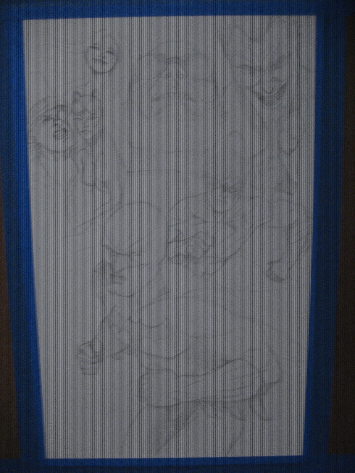
more drawing at the job, took about a 30 minutes on this one, the shoulders and delts need some work but I may turn this into a more finished piece.

 
conte crayon, i haven't used these things in forever!  Love them but it is so different from using the old lead holder.

hulk practice, and the hands still suck but mostly due to the foreshortening of his massive right forearm.  Just needs some tweaks if I turn this into a more finished piece.


Monday, March 26, 2012

Buddha Monkey Print fund

Hello everyone,

Just a quick plea tonight for donations.  One of my artist groups, Speakeasy Primates, is trying to get our 1st three issues of the comic Buddha Monkey printed in color.  I supplied the pencils to issue #2 and I would love to see my work in color print!  The actual goal is fairly small in comparison to some of these other kickstarter campaigns out there so any contribution will be much appreciated.  Please check out this website for the information on how to donate as well as the amounts that will get you special items/art.

http://www.indiegogo.com/buddha-monkey


Sunday, March 25, 2012

A few more pictures

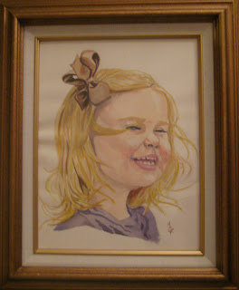
Lately I've been playing around with the old watercolors and it has been hit and miss with the results.  It's been hit and miss because I've been experimenting with a new type of paper and I just tend to ruin things the more they don't turn out the way they were supposed too in my head.   The new type of paper I've been using is hot press watercolor paper instead of the cold press, which I've been taught to use with an iron fist for watercolor since I first starting taking classes for it 20 years ago.  The 1st two images are quick paintings I did of my daughter.  The first one is on hot press paper (140lb) and was finished in about 20 minutes.  The wet into wet technique and the dry brush work both responded well and my only complaint is that wet into wet is MUCH harder to control because the paper is so smooth. The major plus is because of the smooth paper you lose none of the images quality in the scan process. The second painting is on cold press paper (140lb as well) and it reacted just like I always remembered, the water goes wherever you want (for the most part) because of the slight texture in the paper.    So besides a few mistakes I made with her hair I really liked how this one turned out.  It is too large for a scanner so thats why I have a photo of it in it's frame.  However, the cold press images I have scanned tend to seem a shade lighter than if you were looking at it in person and I'm not sure if it's because of the textured paper or my old scanner just sucked.  Both paper stocks still warp at 140 lb so you have to get them under a flat surface with heavy weight after painting or you are stuck with the warped paper.  If you try to fix it after it has set a couple of days you take the chance of getting creases and they look much worse.  The second image is the first relatively big watercolor painting I've done in about 4 years and they just seem to be getting better... oh wait, I haven't gotten to the giant mess up at the bottom of the post yet.  
       The 3rd image is the inside of my new sketch book, I just decided to mess around with some markers and color pencils and I sort of liked the results. 
 So the last one... this thing has been annoying me for about 2 weeks now.  I've even painted over it some more   since this photo was taken (and have yet to fix it.. it seriously looks terrible now).  I've been trying to get a more classical look in my work and this is the perfect example of why not fully planning out a painting will 90% of the time just completely screw up any possibility of it being any good. The other 10% is that time when free form experimentation just truly works and you make something that is just amazing... then you just kill yourself to try and repeat it( this is for me, other artists out there are the opposite.  I have to plan to my skills).  Medusa is lost in the curtains... the curtains just look terrible in general, they were a last second addition.  I wanted this thing to have stark contrasts of light to dark with the characters popping out with the bright/ darker images and the background being kind of this off white marble look... then I added those curtains...  I just thought they would make it look more like a throne room... oh well.  I may fix it or re do the painting, or just call it a learning experience and move on.  


Friday, March 9, 2012

So it's time again for this years Phoenix Comicon Badge Art Contest.  I entered both the Batman and Batwoman paintings that I recently posted online in the past few posts.  If you haven't voted already you can go to phoenixcomicon.com  and click on the badge art contest.  You can vote once and like a painting by facebook log in or by creating a membership with the convention, which allows you to vote everyday on 5 images that you like.  Here are the links directly to my work if you wish to vote.

Phoenix Comicon Badge Art Contest - Batman Arkham City. By Matt Goodallphoenixcomicon.com

http://phoenixcomicon.com/badge_art/voting_detail/156

I'm not sure if that second one is going to work... but I'm note happy with it anyways.


Sunday, February 26, 2012

Art is frustrating...

So, I don't know if you've all heard but the Phoenix Comicon is coming up in a couple of months!  I'm on a wait list to get my own table so hopefully I hear back soon because I really would like to announce (and plan for) that we will be there... Anyways, thats one frustrating thing, another is working on art itself when its just not turning out the way you had planned it.  I spent about 15 hours this weekend working on one small piece and I still don't think I'm happy with it.  The piece itself is an entry for the Phoenix CC badge art contest.  I wanted to do 3  pieces but because of my screw ups... I get one.  Here are the examples, the screwed up water color painting version, the re drawn inked version, and the final   digital painting.


watercolor version- Batwoman has dressed up for PHX CC with her new logo on her belt- hours of grey toning ruined by her unique hip placement(hips thrust forward to show off belt) and bad technique on my part.  I just blacked suit in in frustration.
Re drawn version, no tones, just straight black india ink (Koh-I-Noor brand to be exact)


Digitally painted version- I used several different types of "wet and dry" brushes, no traditional Photoshop air brushes for her.  Closer to what I had in mind for the original water color except I feel it is missing some of the effects that I really wanted to try and add in with the water color... and thats just my lack of digital painting knowledge..

Tuesday, February 21, 2012

Batman- My Process

 Hello there everyone,

Today I am posting my most recent piece, a commission of Batman- Arkham City.  Now, this is not a completely faithful following of the artwork for the game (which I find to be amazing) but my own version of Bats and friends.  Now, you may be wondering 2 things( probably more) why only these characters and why are the photos so shitty?  Great questions!  The commission was basically free reign for me, all that was requested was Batman and Nightwing from the game with one color integrated into the black and white.  So I basically decided to use the characters which I know are in the game and that I personally like and thought of something fun to draw and to try something different stylistically for a change (which I hope to keep building on more).  As for the picture quality... well thats what happens when you drop a digital camera several thousand times, the several thousand and first time creates an awesome grid effect on our photos every once and a while (which I personally love for experimental photography, which I may post a few of the cooler ones on here sooner or later but sucks because you never know when it will work now).  Anyways, here are some basic descriptions on how I got from pencils to finished scan, enjoy!
Pencils, this is mostly 4h with some 2h added in for some of the areas i wanted to emphasize.   But this is mostly a flat drawing on high end watercolor paper.  most of this was lightened even more after the photo so the pencils will not overpower the ink wash or paint.

Ink wash one, mostly a Winsor & Newton  mop brush with a #6 round for the areas i didn't want to bleed. 


More is ink added to my tub of ink and water to help create a little darker tone for the wash.
Added another layer of grey with a splash more of ink to help create definition.  Batman is inked with an even smaller Winsor & Newton round brush and Speedball nib (sorry, I can't remember which quill point it is but it's small, for good line control) 


Batman is defined a bit more and then I work my "one color" into the "dream state" or "collage" or whatever else you want to call it background.  I like dream state because I was going for the "who the hell can I trust/ beat the crap out" of  mind set of Batman.  This is first a layer of phthalo blue and sky blue mopped over the grey tone with hints of green and permanent rose.  the lines are straight indigo blue.


Final Scanned image.  Some of the defining colors of the friends and villains are dabbed in and Batman's cowl and gauntlets are darkened a bit more with ink wash.
    

Sunday, February 12, 2012

Oscillate Wildly and fun with markers

Oscillate Wildly, Pg 1 panel 2

Kate Bishop, Hawkeye, Copics, india ink

Random, markers and ink

Angel lost her wings, markers, ink

Dark Mary Marvel, markers, ink
So I've been putting in a normal 40 hour work week (ugh) plus another 20+ (more then that too if you count the hours i put in on my down time at the real job) of my own time for the past 4 weeks to pencil, ink, and grey tone the story Oscillate Wildly.  For all the time I put in I'm generally happy with the outcome.  As always, I completed it and I'm really happy with some images while also really wishing I had time to re work others... but I don't.  Deadline is here and I'm just glad to be done with it.  As much as I love telling straight forward stories I'm excited to try and push myself into new genres and explore mixing in a "painterly"style into my work.  I have several ideas for images that I hope to have done in time for Phoenix Comicon... scratch that, I Will have done in time for Comicon.  Here are some practice images in markers that will be somewhat similar to what I will have in store for you once con rolls aroundbut think more Hopper and less pin up .