So it's time again for this years Phoenix Comicon Badge Art Contest. I entered both the Batman and Batwoman paintings that I recently posted online in the past few posts. If you haven't voted already you can go to phoenixcomicon.com and click on the badge art contest. You can vote once and like a painting by facebook log in or by creating a membership with the convention, which allows you to vote everyday on 5 images that you like. Here are the links directly to my work if you wish to vote.
Phoenix Comicon Badge Art Contest - Batman Arkham City. By Matt Goodallphoenixcomicon.com
http://phoenixcomicon.com/badge_art/voting_detail/156
I'm not sure if that second one is going to work... but I'm note happy with it anyways.
Friday, March 9, 2012

Sunday, February 26, 2012
Art is frustrating...
So, I don't know if you've all heard but the Phoenix Comicon is coming up in a couple of months! I'm on a wait list to get my own table so hopefully I hear back soon because I really would like to announce (and plan for) that we will be there... Anyways, thats one frustrating thing, another is working on art itself when its just not turning out the way you had planned it. I spent about 15 hours this weekend working on one small piece and I still don't think I'm happy with it. The piece itself is an entry for the Phoenix CC badge art contest. I wanted to do 3 pieces but because of my screw ups... I get one. Here are the examples, the screwed up water color painting version, the re drawn inked version, and the final digital painting.
 |
| watercolor version- Batwoman has dressed up for PHX CC with her new logo on her belt- hours of grey toning ruined by her unique hip placement(hips thrust forward to show off belt) and bad technique on my part. I just blacked suit in in frustration. |
 |
| Re drawn version, no tones, just straight black india ink (Koh-I-Noor brand to be exact) |
 |
| Digitally painted version- I used several different types of "wet and dry" brushes, no traditional Photoshop air brushes for her. Closer to what I had in mind for the original water color except I feel it is missing some of the effects that I really wanted to try and add in with the water color... and thats just my lack of digital painting knowledge.. |
Tuesday, February 21, 2012
Batman- My Process
Hello there everyone,
Today I am posting my most recent piece, a commission of Batman- Arkham City. Now, this is not a completely faithful following of the artwork for the game (which I find to be amazing) but my own version of Bats and friends. Now, you may be wondering 2 things( probably more) why only these characters and why are the photos so shitty? Great questions! The commission was basically free reign for me, all that was requested was Batman and Nightwing from the game with one color integrated into the black and white. So I basically decided to use the characters which I know are in the game and that I personally like and thought of something fun to draw and to try something different stylistically for a change (which I hope to keep building on more). As for the picture quality... well thats what happens when you drop a digital camera several thousand times, the several thousand and first time creates an awesome grid effect on our photos every once and a while (which I personally love for experimental photography, which I may post a few of the cooler ones on here sooner or later but sucks because you never know when it will work now). Anyways, here are some basic descriptions on how I got from pencils to finished scan, enjoy!
Today I am posting my most recent piece, a commission of Batman- Arkham City. Now, this is not a completely faithful following of the artwork for the game (which I find to be amazing) but my own version of Bats and friends. Now, you may be wondering 2 things( probably more) why only these characters and why are the photos so shitty? Great questions! The commission was basically free reign for me, all that was requested was Batman and Nightwing from the game with one color integrated into the black and white. So I basically decided to use the characters which I know are in the game and that I personally like and thought of something fun to draw and to try something different stylistically for a change (which I hope to keep building on more). As for the picture quality... well thats what happens when you drop a digital camera several thousand times, the several thousand and first time creates an awesome grid effect on our photos every once and a while (which I personally love for experimental photography, which I may post a few of the cooler ones on here sooner or later but sucks because you never know when it will work now). Anyways, here are some basic descriptions on how I got from pencils to finished scan, enjoy!
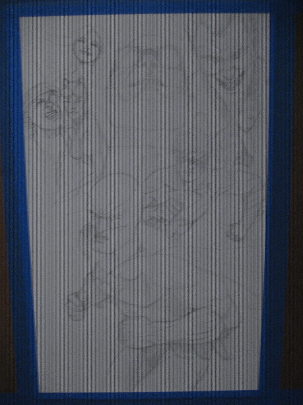 |
| Pencils, this is mostly 4h with some 2h added in for some of the areas i wanted to emphasize. But this is mostly a flat drawing on high end watercolor paper. most of this was lightened even more after the photo so the pencils will not overpower the ink wash or paint. |
 |
| Ink wash one, mostly a Winsor & Newton mop brush with a #6 round for the areas i didn't want to bleed. |
 |
| More is ink added to my tub of ink and water to help create a little darker tone for the wash. |
 |
| Added another layer of grey with a splash more of ink to help create definition. Batman is inked with an even smaller Winsor & Newton round brush and Speedball nib (sorry, I can't remember which quill point it is but it's small, for good line control) |
 |
| Batman is defined a bit more and then I work my "one color" into the "dream state" or "collage" or whatever else you want to call it background. I like dream state because I was going for the "who the hell can I trust/ beat the crap out" of mind set of Batman. This is first a layer of phthalo blue and sky blue mopped over the grey tone with hints of green and permanent rose. the lines are straight indigo blue. |
 |
| Final Scanned image. Some of the defining colors of the friends and villains are dabbed in and Batman's cowl and gauntlets are darkened a bit more with ink wash. |
Sunday, February 12, 2012
Oscillate Wildly and fun with markers
 |
| Oscillate Wildly, Pg 1 panel 2 |
 |
| Kate Bishop, Hawkeye, Copics, india ink |
 |
| Random, markers and ink |
 |
| Angel lost her wings, markers, ink |
 |
| Dark Mary Marvel, markers, ink |
Tuesday, January 24, 2012
A new panel
Hello all, so I've already broke my resolution to post once a week... oh well. Here is a treat for you to show that yes, I actually have been working on art and not just working my day job and playing xbox...
 This is a panel from page one of Oscillate Wildly, which will be a story in Unite and Take Over 2 published by Spazdog Press. Hopefully I did my job and you can tell this is a scene in a doughnut shop... This is pre grey tone and pre clean up. If you look close you can see all my sketchyness, mistakes and possible word balloons in the mix. This is 2h pencil, brush with india ink, Pitt india ink pens for straight lines all on canson comic board... so it can't take ink wash being much too light weight of paper, it would warp like all hell and look terrible. Plus I can cheat and clean up any mistakes in Photoshop so thats how I'll paint the grays.

Thursday, January 5, 2012
Watercolor step by step
So I figured I would post a nice step by step tutorial of sorts for my painting process. Of course I got a little carried away and forgot to write down everything I did and stop and take photos. But, this still is a pretty good example of how I go about creating my watercolor paintings. So here we go..
 |
| Initial Pencils, lightly drawn with a 2h and 4h pencil on Arches watercolor paper. I like to keep the pencils light so they won't take away from the paint. |
 |
| 1st layer of paint is mop brushed in. I generally soak the areas i want the paint to flow into and then dab in light tones as a underpainting effect. Then I added some darker tones to the areas that will help give the painting a full range of values and depth. |
 |
| So I forgot to take pictures of some of the rendering phases so this is painting as almost complete. I've added in quite a bit of burnt sienna and indigo blue for my dark values along with mixing in quite a bit of permanent magenta for my warmer values for wolvie's skin tone. |
 |
| So here is the finished version (for now). I've added in some watered down india ink to give wolverine a slight "inking" look and to really add some darks into the shadow areas. Once dry I will probably go back in and add some more darks to the image to finish fleshing out all the values I want in there. |
Sunday, January 1, 2012
I'm Back
I'm back with a new years resolution to keep up on my blogging so we will see how long it takes for me to break it again. I've worked on quite a few new images and it will take too long to post them all so just check out my deviantart page if you want to catch up on things. New pictures are in the works and will be posted soon, I'm trying out some new techniques and we will see if they will be beneficial to my work. Happy New year everyone!
Matt
Subscribe to:
Posts (Atom)