Pages

Sunday, February 26, 2012

Art is frustrating...

So, I don't know if you've all heard but the Phoenix Comicon is coming up in a couple of months!  I'm on a wait list to get my own table so hopefully I hear back soon because I really would like to announce (and plan for) that we will be there... Anyways, thats one frustrating thing, another is working on art itself when its just not turning out the way you had planned it.  I spent about 15 hours this weekend working on one small piece and I still don't think I'm happy with it.  The piece itself is an entry for the Phoenix CC badge art contest.  I wanted to do 3  pieces but because of my screw ups... I get one.  Here are the examples, the screwed up water color painting version, the re drawn inked version, and the final   digital painting.


watercolor version- Batwoman has dressed up for PHX CC with her new logo on her belt- hours of grey toning ruined by her unique hip placement(hips thrust forward to show off belt) and bad technique on my part.  I just blacked suit in in frustration.
Re drawn version, no tones, just straight black india ink (Koh-I-Noor brand to be exact)


Digitally painted version- I used several different types of "wet and dry" brushes, no traditional Photoshop air brushes for her.  Closer to what I had in mind for the original water color except I feel it is missing some of the effects that I really wanted to try and add in with the water color... and thats just my lack of digital painting knowledge..

Tuesday, February 21, 2012

Batman- My Process

 Hello there everyone,

Today I am posting my most recent piece, a commission of Batman- Arkham City.  Now, this is not a completely faithful following of the artwork for the game (which I find to be amazing) but my own version of Bats and friends.  Now, you may be wondering 2 things( probably more) why only these characters and why are the photos so shitty?  Great questions!  The commission was basically free reign for me, all that was requested was Batman and Nightwing from the game with one color integrated into the black and white.  So I basically decided to use the characters which I know are in the game and that I personally like and thought of something fun to draw and to try something different stylistically for a change (which I hope to keep building on more).  As for the picture quality... well thats what happens when you drop a digital camera several thousand times, the several thousand and first time creates an awesome grid effect on our photos every once and a while (which I personally love for experimental photography, which I may post a few of the cooler ones on here sooner or later but sucks because you never know when it will work now).  Anyways, here are some basic descriptions on how I got from pencils to finished scan, enjoy!
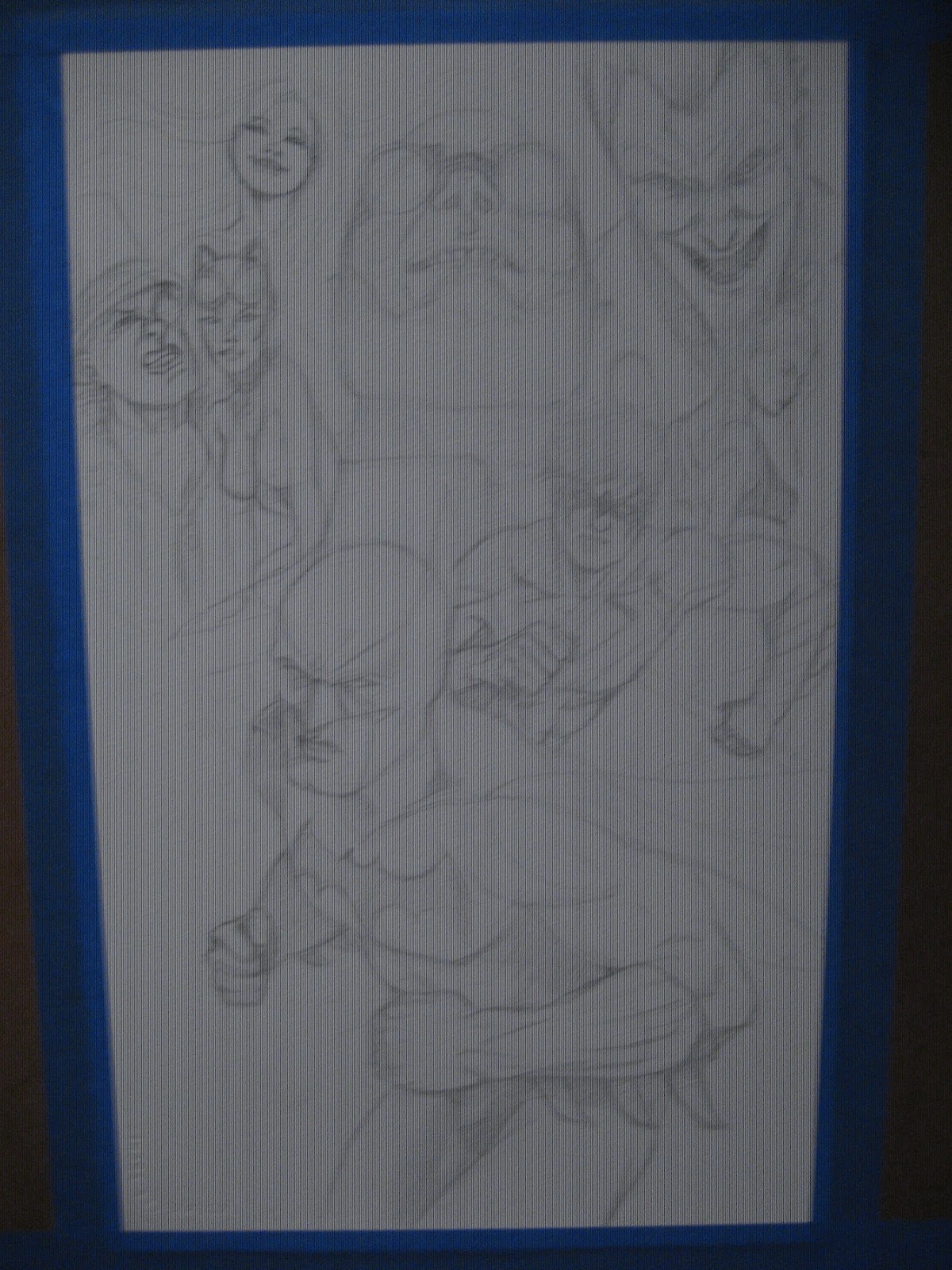
Pencils, this is mostly 4h with some 2h added in for some of the areas i wanted to emphasize.   But this is mostly a flat drawing on high end watercolor paper.  most of this was lightened even more after the photo so the pencils will not overpower the ink wash or paint.

Ink wash one, mostly a Winsor & Newton  mop brush with a #6 round for the areas i didn't want to bleed. 


More is ink added to my tub of ink and water to help create a little darker tone for the wash.
Added another layer of grey with a splash more of ink to help create definition.  Batman is inked with an even smaller Winsor & Newton round brush and Speedball nib (sorry, I can't remember which quill point it is but it's small, for good line control) 


Batman is defined a bit more and then I work my "one color" into the "dream state" or "collage" or whatever else you want to call it background.  I like dream state because I was going for the "who the hell can I trust/ beat the crap out" of  mind set of Batman.  This is first a layer of phthalo blue and sky blue mopped over the grey tone with hints of green and permanent rose.  the lines are straight indigo blue.


Final Scanned image.  Some of the defining colors of the friends and villains are dabbed in and Batman's cowl and gauntlets are darkened a bit more with ink wash.
    

Sunday, February 12, 2012

Oscillate Wildly and fun with markers

Oscillate Wildly, Pg 1 panel 2

Kate Bishop, Hawkeye, Copics, india ink

Random, markers and ink

Angel lost her wings, markers, ink

Dark Mary Marvel, markers, ink
So I've been putting in a normal 40 hour work week (ugh) plus another 20+ (more then that too if you count the hours i put in on my down time at the real job) of my own time for the past 4 weeks to pencil, ink, and grey tone the story Oscillate Wildly.  For all the time I put in I'm generally happy with the outcome.  As always, I completed it and I'm really happy with some images while also really wishing I had time to re work others... but I don't.  Deadline is here and I'm just glad to be done with it.  As much as I love telling straight forward stories I'm excited to try and push myself into new genres and explore mixing in a "painterly"style into my work.  I have several ideas for images that I hope to have done in time for Phoenix Comicon... scratch that, I Will have done in time for Comicon.  Here are some practice images in markers that will be somewhat similar to what I will have in store for you once con rolls aroundbut think more Hopper and less pin up .